redesigning glance
surveys
Zero-to-One System
Consumer UX
Behavioral Design
Lock Screen Surface
Surveys on Glance operated under extreme constraints: no intent, low patience, and high cognitive load.

Behavioral Architecture
Designing for users who never intended to take a survey
Core Insight
The Zero-Intent Problem
Users arrived on the lock screen with no awareness that a survey existed. They had no mental model, no expectation, and no motivation.
Traditional survey UX assumes voluntary participation. This required designing an entire behavioral system—from attention capture to trust building to sustained engagement— before a single question could be asked.
Capture attention without disruption
Signal value before effort
Build trust through transparency
Sustain engagement to completion
Constraint
Attention Budget: 2 Seconds
Users unlock their phones dozens of times per day. Each unlock is a micro-decision point.
If a survey card didn't communicate value instantly, users would dismiss it as noise.
Decision window
~2s
Eligibility Before Effort
Traditional surveys disqualify users mid-flow, after they've invested time and attention.
We surfaced eligibility signals upfront to prevent rage exits and preserve long-term trust.
✕
Start → Answer → Disqualify
✓
Check → Signal → Start
SYSTEM DECISION
Completion Quality
↑
Thoughtful responses
Fewer pattern answers, more deliberate choices
Early Abandonment
↓
First-stage exits
Clearer value signals reduced early drop-off
Trust Signals
↑
Repeat engagement
Consistent reward delivery built habit
the problem worth solving
When we started, there was no reward infrastructure inside Glance. There were no systems for discovery, redemption, tracking, attribution, campaign orchestration, or targeted cohorts.


Before Design Intervention
Context & Constraints
Zero-Intent Surface
Users never came with the intention to answer surveys. Every interaction had to earn attention in seconds.
High Cognitive Load
Surveys demand thinking, recall, and judgment—directly conflicting with lock-screen behavior.
Low Patience Window
Users decide to continue or drop within the
first few interactions.
Trust-Sensitive Rewards
Rewards required transparency and clarity before
users invested effort.
Users Are Not One Persona
Different motivations required different survey design strategies
EXPLORER
Curiosity-Driven User
Signals
•
Enjoys novelty
•
Low tolerance for boredom
Primary Friction
Static, repetitive survey flows
Expectation
Delight, variation, quick wins
REWARD SEEKER
Outcome-Oriented User
Signals
•
Motivated by cash / value
•
Time-sensitive
Primary Friction
Unclear effort-to-reward ratio
Expectation
Upfront clarity on time & payout
SKEPTIC
Low-Trust User
Signals
•
Fear of disqualification
•
Avoids wasted effort
Primary Friction
Opaque rules and sudden exits
Expectation
Predictability and transparency
The Real Problem Wasn't Surveys
It was designing trust and motivation in a zero-attention environment
Zero Intent Environment
Users did not arrive to "take surveys".
Surveys interrupted passive consumption.
Lock Screen Context
Unknown Effort Cost
Users had no signal for:
–
survey length
–
difficulty
–
disqualification risk
Cognitive Load
Trust Debt
Early exits and silent disqualifications
trained users to abandon quickly.
Behavioral Decay
What Actually Happened
Speeding through
Pattern answering
Random selection
What Users Saw
When we started, there was no reward infrastructure inside Glance. There were no systems for discovery, redemption, tracking, attribution, campaign orchestration, or targeted cohorts.
Strongly
Disagree
Disagree
Agree
Strongly
Agree
I find this product easy to use
The interface is intuitive
I would recommend this
The design is visually appealing
High scanning cost
Repetitive pattern
Decision fatigue
What Users Saw
When we started, there was no reward infrastructure inside Glance. There were no systems for discovery, redemption, tracking, attribution, campaign orchestration, or targeted cohorts.
Grid Question format

Design Strategy
Principles that guided every design decision
what all did i wanted in the design
When we started, there was no reward infrastructure inside Glance. There were no systems for discovery, redemption, tracking, attribution, campaign orchestration, or targeted cohorts.

Key Design Interventions
How specific design choices addressed specific failures
Problem
Grid questions caused cognitive overload and low-quality responses.
Intervention
Break grids into single-question, step-by-step interactions.
Result
Users focused on one decision at a time instead of pattern answering.
After Design Intervention
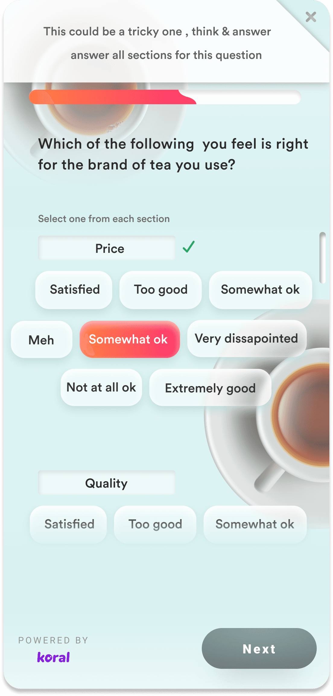
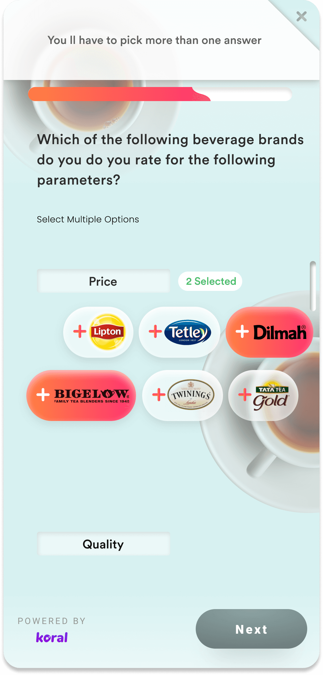
Simplified the complex grid questions which resulted in lesser drop-off
Problem
Users didn't know how long a survey would take.
Intervention
Introduce upfront effort signals (question count, progress).
Question 2 of 5
~1 min left
Result
Reduced anxiety and early abandonment.
After Design Intervention

Problem
Users felt punished by sudden disqualification.
Intervention
Surface eligibility signals before effort.
You're eligible for this survey
Based on your profile and location
Result
Higher trust, fewer rage exits.
After Design Intervention


Problem
Motivation dropped mid-survey.
Intervention
Add micro-reassurance and reward reminders.
Almost there!
3 of 5
You are so close to winning 100 INR
Result
Sustained engagement through completion.
After Design Intervention
Added motivation , celebration and live tracking & completion for avoiding exhaustion and certainity which resulted in higher completion rate
Rewards as a System, Not an Incentive
How surveys, rewards, and trust were designed to work together
From Lockscreen to Deep-link
I replaced a one-off coupon interaction with a structured behavioural journey designed to move users from passive discovery to repeat engagement.
Survey Entry
Lock screen
Effort Signals
Length & time
Completion
Last answer
Reward
Visibility
Confirmation
Wallet
Rewards hub
Future Motivation
After Design Intervention


Rewards page before & after
design there is a full ecosystem
surveys people who take surveys
etc Increased engagement
rate manifold
Effort–Reward Transparency
Users could see what they would earn before committing effort.
?
5
Delayed Gratification, Done Right
Rewards were reinforced even when not immediately redeemed.
Trust Compounds Over Time
Consistent reward behavior trained users to complete future surveys.
Designing for Edge Cases
Because real users don't behave ideally
Disqualification Transparency
Description: Silent disqualifications eroded trust rapidly.
Guardrail: Surface eligibility status early and explain outcomes clearly.
Eligibility Status
Eligible
Based on your profile
Not eligible this time
Check back for new surveys
Too Fast Responses
Description: Users rushing through surveys risked poor data quality.
Guardrail: Introduce minimum interaction time and soft warnings.
Response Time
Min Time
Please take your time to read each question carefully
Low-Quality Answers
Description: Repeated patterns and random selections reduced signal quality.
Guardrail: Detect response patterns and flag unreliable sessions.
Pattern Detection
Quality check active
Mid-Survey Drop-Off
Description: Users exiting halfway lost context and motivation.
Guardrail: Provide graceful exits with clarity on progress and rewards.
Exit Path
Continue
Safe Exit
You've completed 3 of 5 questions. Exit now or continue to earn your reward.
After Design Intervention


My Lessons :Designing Under Ambiguity
When we started, there was no reward infrastructure inside Glance. There were no systems for discovery, redemption, tracking, attribution, campaign orchestration, or targeted cohorts.This was my first project at Glance and a formative one.
It taught me how to design systems under extreme constraints
where attention is scarce, intent is absent, and trust must be earned
before any meaningful interaction can happen.
Before design & after
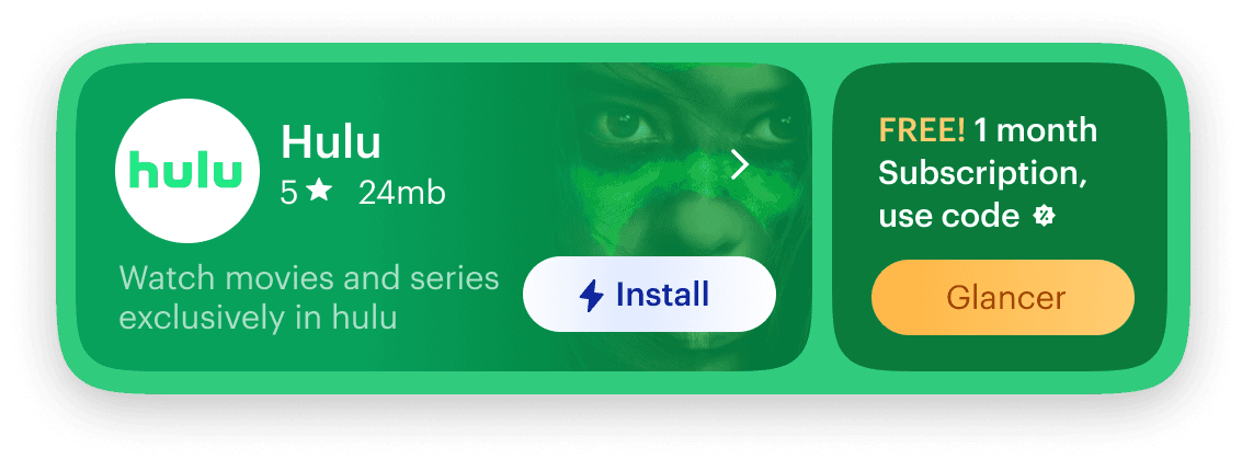
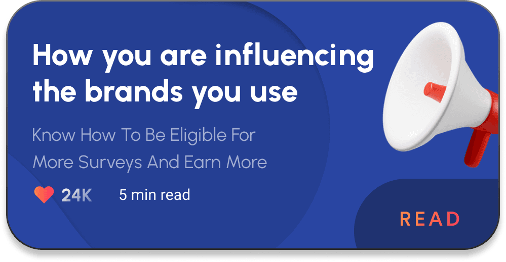
Users were surrounded by offers, but rarely motivated to act. The issue wasn’t lack of supply , it was cognitive friction between seeing value and committing to it.


The redesign stabilized performance and improved advertiser trust during Pulse’s active years, driving stronger completion and attribution quality signals.
The product continued to deliver measurable value for customers over time.
Its eventual retirement in 2022 was driven by broader strategic shifts in the business and product portfolio, not by a failure of the design itself.
read next
read next curated case study